Famous Websites Early Times
Trying to catch up with the latest technologies on your website and doing lots of art design to show up? Creating a website is more and more easy today because of the fast tech development, more and more person and groups are replying on internet heavily. A professional websit and beautify design will attract visitors' eye-balls and increase potential business opportunities.
What're the leading websites today? I'm sure everybody be able to speak out lots of names like google, facebook, youtube, twitter etc. However, are you aware of such websites' old times and how does it look like exactly? I'm curious of them for some time and just did an research on internet. Luckily I got the screenshots for most of them and I'm glad to post here if you're looking for similar articles.
The idea I want to share with this article is simply to tell this: Don't be scared by the task of website creating if you're new and we don't actually need to make everything perfect because it'll be a long term's development. The newest technology today might be pretty old after we take a nice sleep. Just improve it in our daily experience and treat it as a common work in daily life. Ok, let's see some famous websites' old time's screenshots and look how they're doing now.
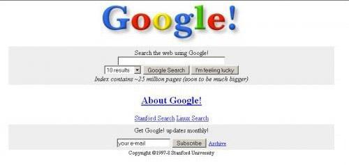
Google, almost the name of today's internet and the highest traffic website in the world. Google search is always the first action when something we're not sure. However, their old time's website design is not so nice as the current one. simply home page and simple search result page. No more options to select such as date range, search recommendations etc.
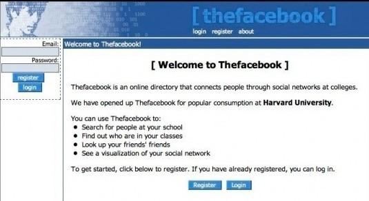
Facebook, the biggest and most successful social network site today. The current user registration is over 500 millions globally. However, if you take a look over their old website design above, do you still want to join with? I think no.
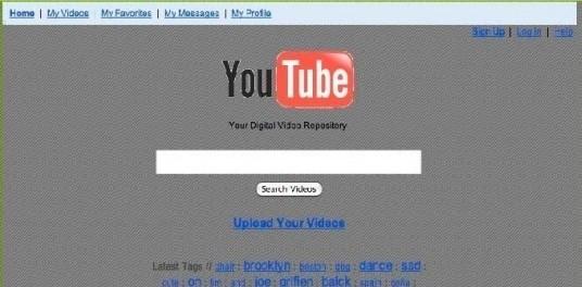
Youtube, the above sceenshot looks strange right? If we see such website today, the first impression would be sexual meterial stuff. However, this is exactly the old design of youtube website.
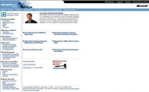
Microsoft, that's serving almost every family on the earth, their website is being learned and visited by all programmers over the world. Can you imagine the above screenshot is their old website design?

Hotmail, one of the most popular free email service provider. Today it's integrated with many MS services like MSN and partnership website logins etc. However, the hotmail website original design is just as simple as above pic. No more functions prepared but only email.
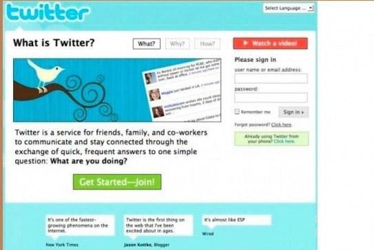
Twitter, the most successful micro blog system and almost introduced into every online business today. Do you feel good with the color above? That's how twitter is designed in the old times.
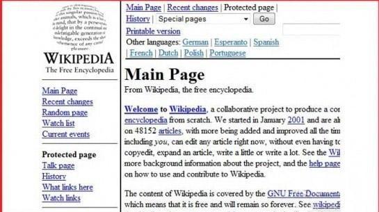
Wikipedia, the most powerful wiki knowledge base and terms explanation website. If you look above pic you can't imagine it's for wikipedia right? But that's the exact look of it and the interface only changed several years' ago.
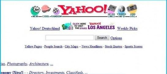
Yahoo, the most successful search engine and portal website before google apeared. It's still playing an important role on internet business regardless of any change with it. However, if we take a look at the old yahoo screenshot, we can only describle with one word "ugly".
